OneDegree, 2020
Redesign Purchase Flow of Virtual Insurance of Pet
At-A-Glance
Timeline
Jul - Aug 2020: Main purchase flow
Sep - Oct 2020: Promo code for purchase flow (omitted in this case study)
Deliverables
UX design of purchase flow and promo code features. Established a purchase flow framework for other insurance products.
Contributors
In this project, I worked closely with a PM, a UI designer, and 3 front-end engineers.
Jump to section
01 Background
When I joined the OneDegree virtual insurance team, the team was preparing to migrate policies and customer data from an open-source system to the system developed by another team within OneDegree.
Our goal was to redesign the pet insurance purchase experience by April 2021, creating a more streamlined, user-friendly flow that improved both the visuals and user experience from Pet 1.0.
02 Challenge
Without agents and brokers' help,
customers have to finish purchasing the insurance product on their own.
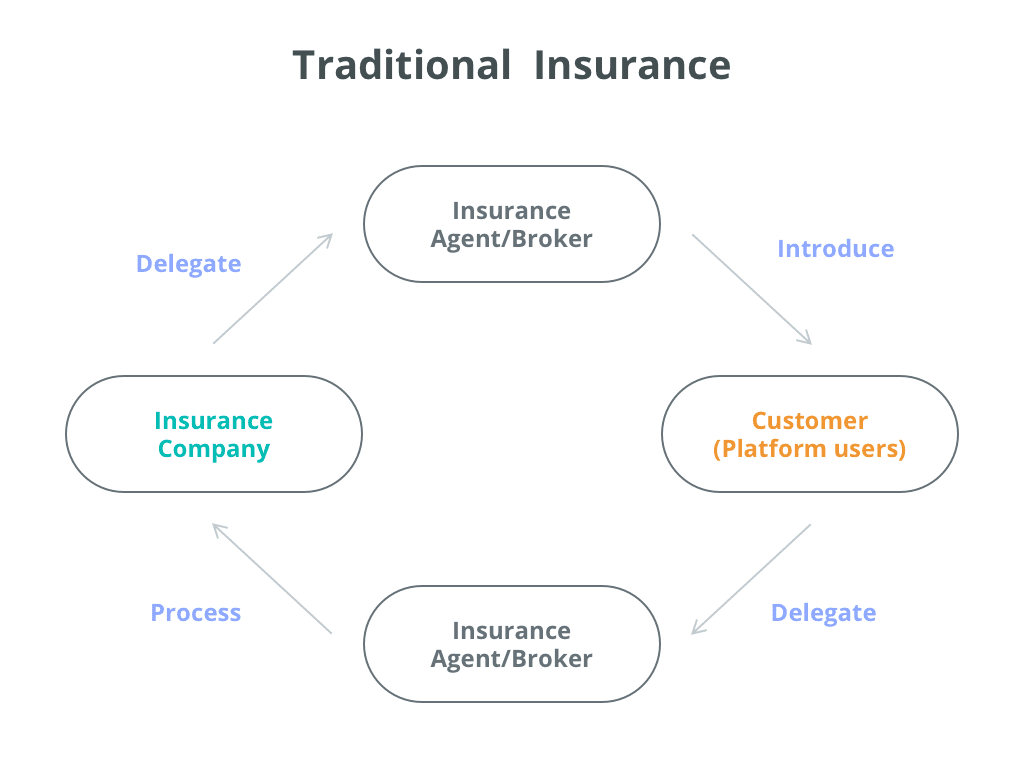
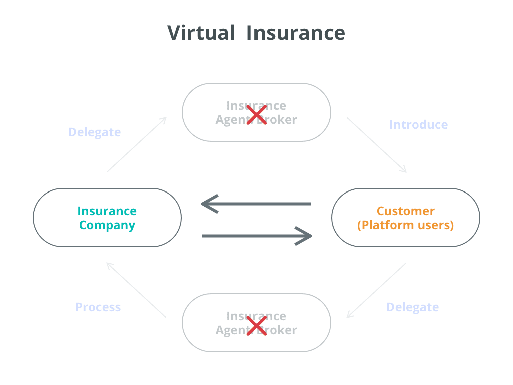
Problem of users
Problem of insurance operation team
Problem Statement:
A lack of insurance knowledge stops users from continuing the flow.
We need to find ways to help users get what they need!
03 Process
Since we want to provide a purchase experience that is different from traditional insurance services, the challenges were how do we build the flow simple while it is transparent and legal at the same time.
After defining problems and initial ideation, we invited stakeholders professionals in insurance, such as members of the Risk team and Actuarial team, to have two rounds of design critique to ensure our flow obeys the insurance rules and law.
IA flow of Pet 2.0 Purchase
UX flow ideation
04 Finding & Ideation
After analyzing the customers’ feedback sheet provided by the customer service team, PM and I had some findings, and we set them as our hypothesis.
Why couldn’t user understand the policy coverage?
Information wasn't well grouping
Some information was related but wasn't on the same page in Pet 1.0, so when users couldn't get all the info they wanted, it would stop them from moving to the next step.
Information was hidden or insufficient
Some of the information was hidden as default, and users had to click to expand more details. It isn’t very pleasant for users to interact with every column.
Other information was the things users cared about, but we didn’t provide in the flow, such as policy effective date, waiting period, and policy end date.
3 Core Principles
Based on our hypothesis, I defined 3 principles that I complied with when designing the new experience.
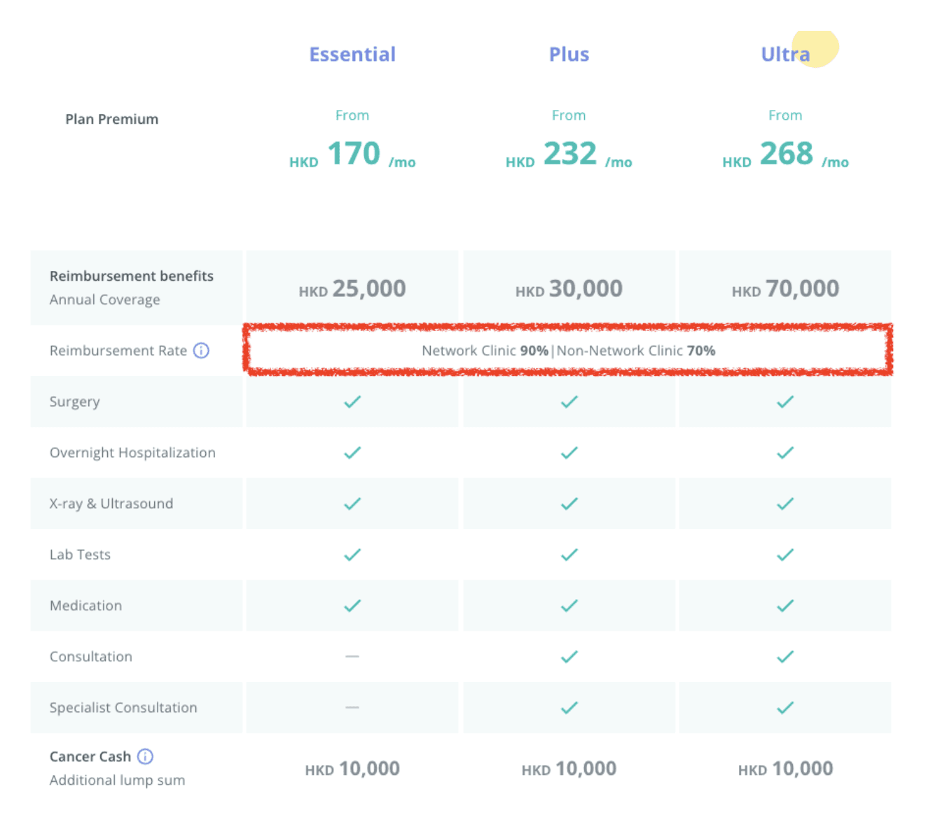
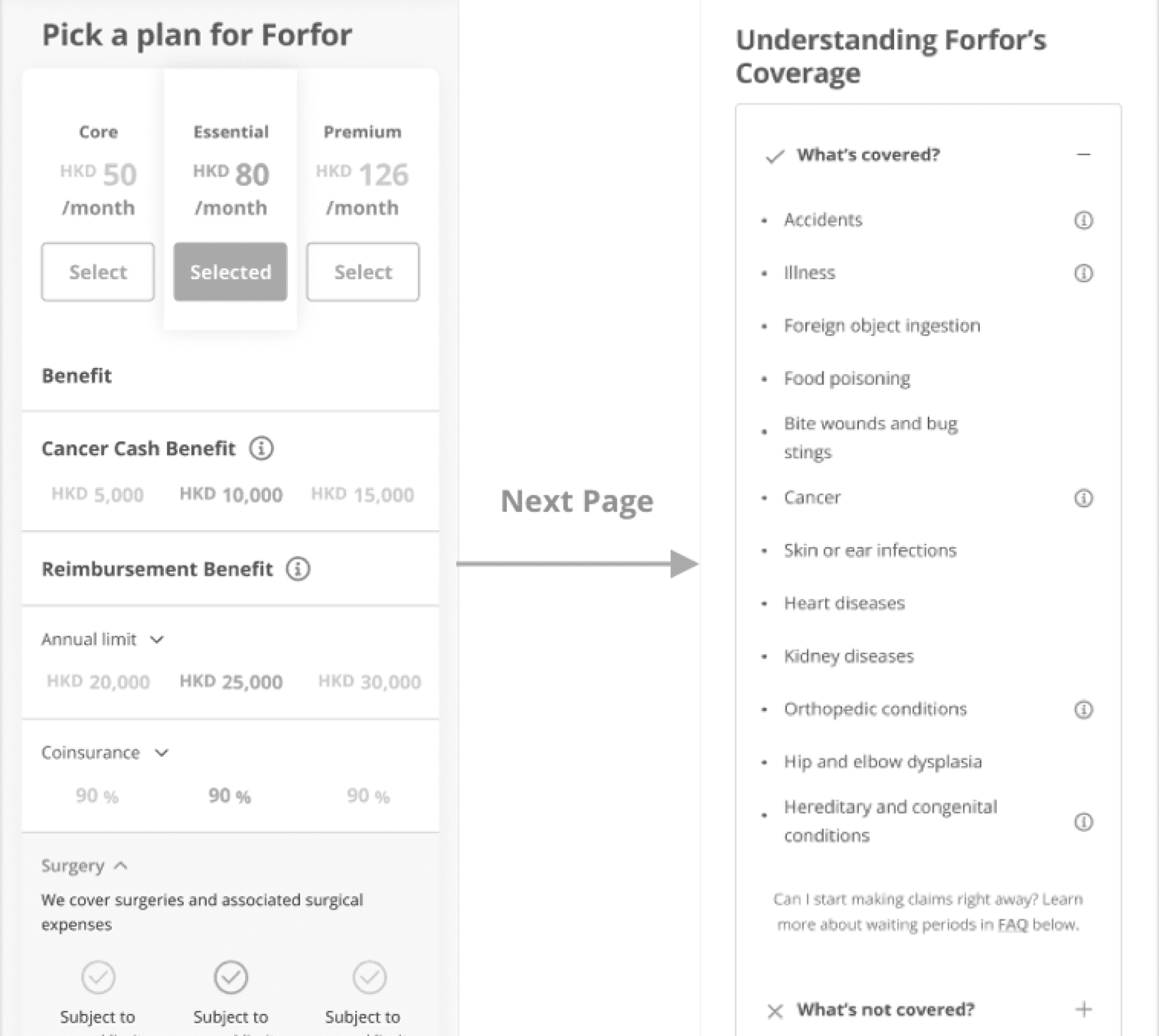
For example, there’s a concept called “Deductible”, which means policyholders have to afford the cost partly, this is more passively to understand.
People usually care about how many benefits can they take, instead of counting how much they have to pay when having a claim.
So we turned this concept into “Reimbursement Rate”, users can directly get how much money can they get from insurance companies.
Pet 2.0 Plan Table on Pet Insurance Landing Page
For example, in Pet 1.0, when viewing the plan table, users would like to know about coverage.
Users might stop on the plan page and try to ask for more details from customer service even though the coverage info was on the next page just because they didn’t see it on plan page.
Plans and coverage table in Pet 1.0 Purchase Flow
After realizing this behavior, we use a pop-up modal to display the coverage details instead of showing the coverage table in another page.

Plans and coverage table in Pet 2.0 Purchase Flow
05 Design Outcome
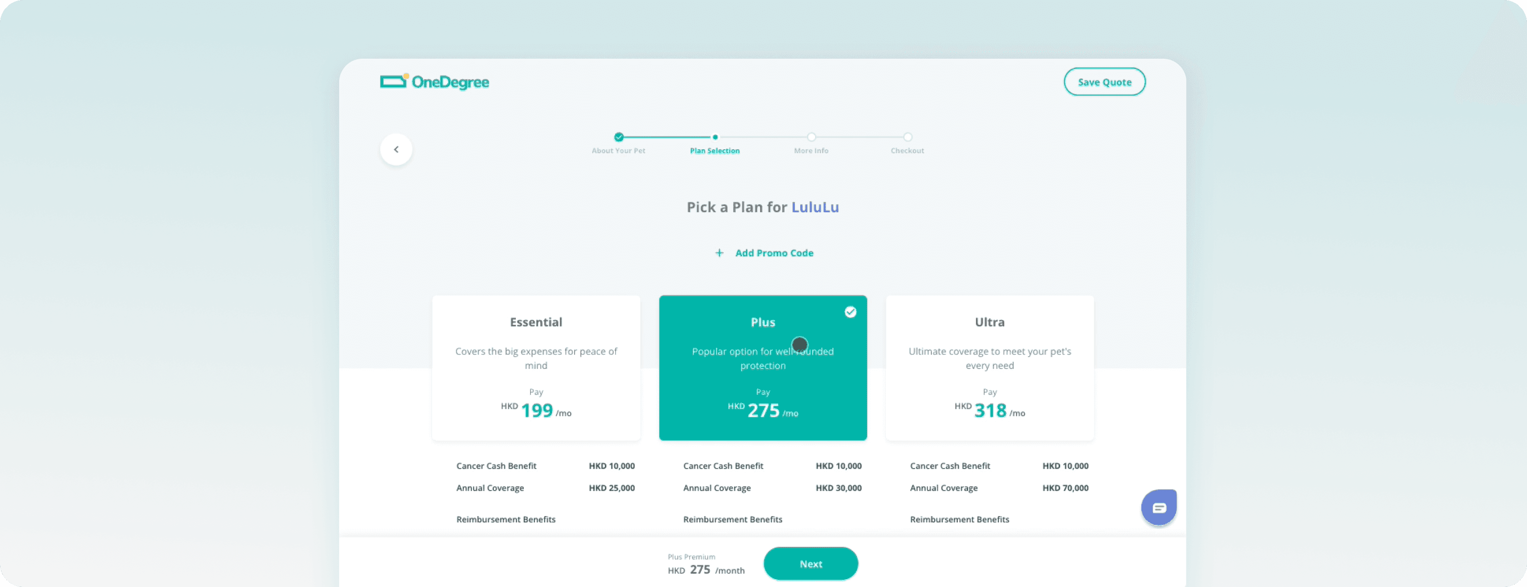
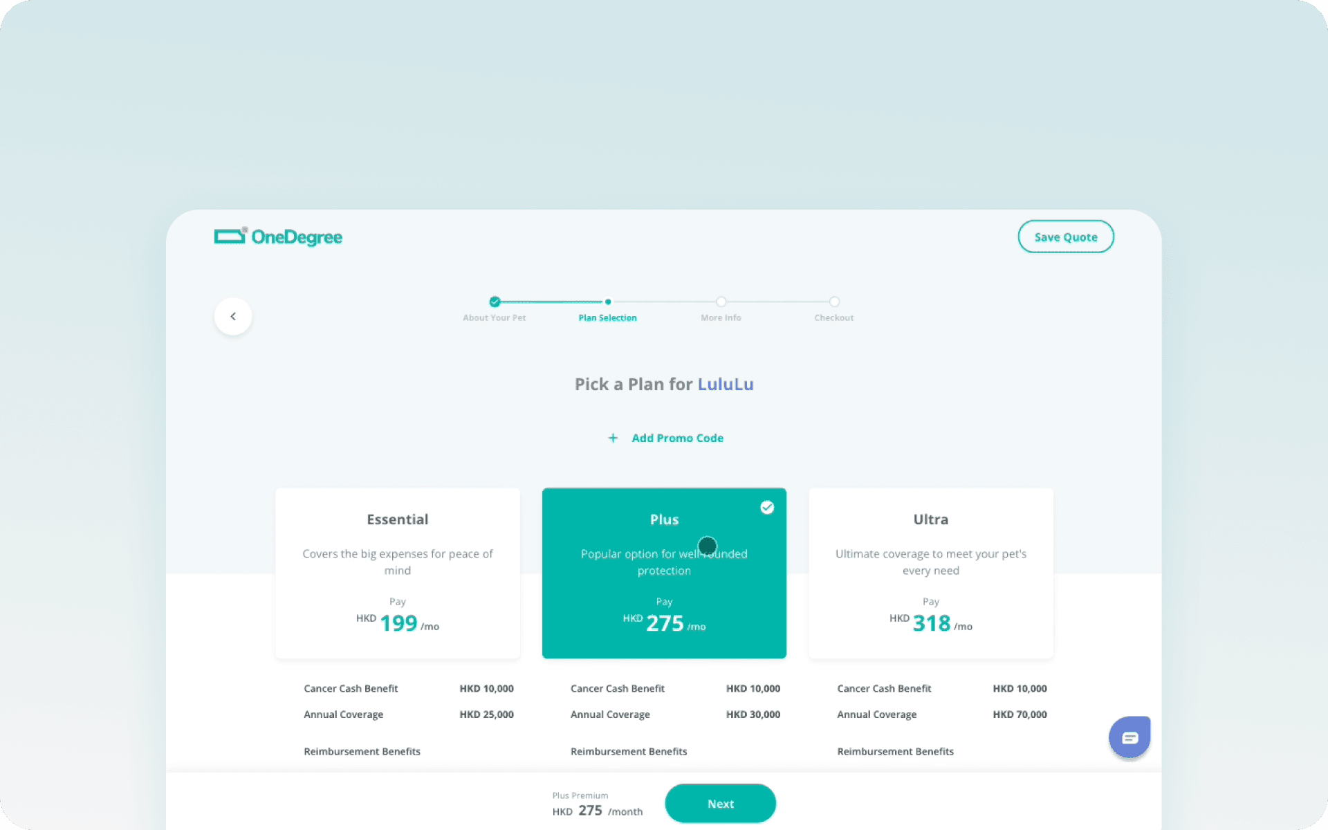
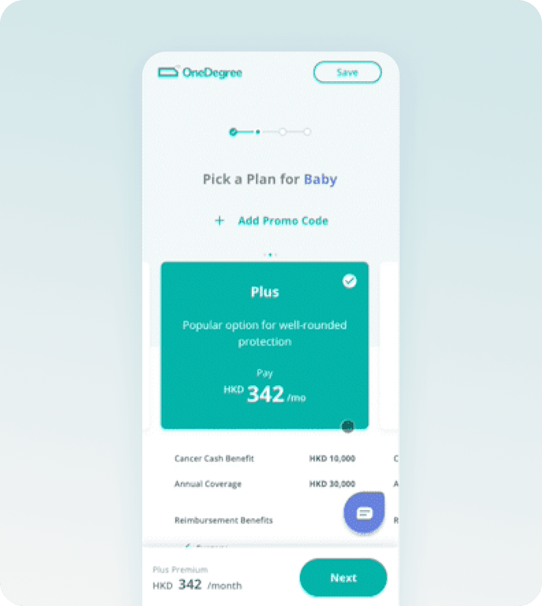
This is a recording of me reviewing the testing front-end page. Let’s dive into some design breakdowns!
Reorganized the information in the purchase flow
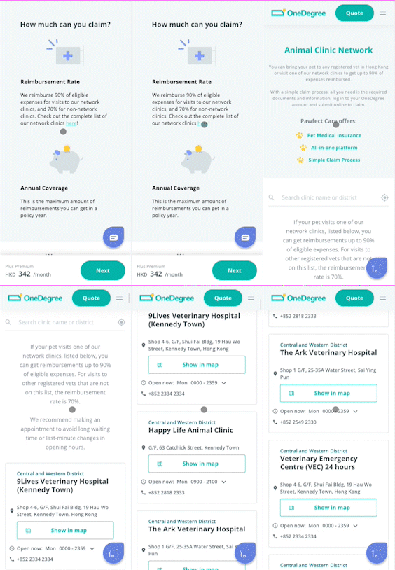
Many users ask about the clinic list when they see the reimbursement rates are different between network and non-networks.
We provide a list’s entrance by the content, so they don’t have to ask customer service anymore.
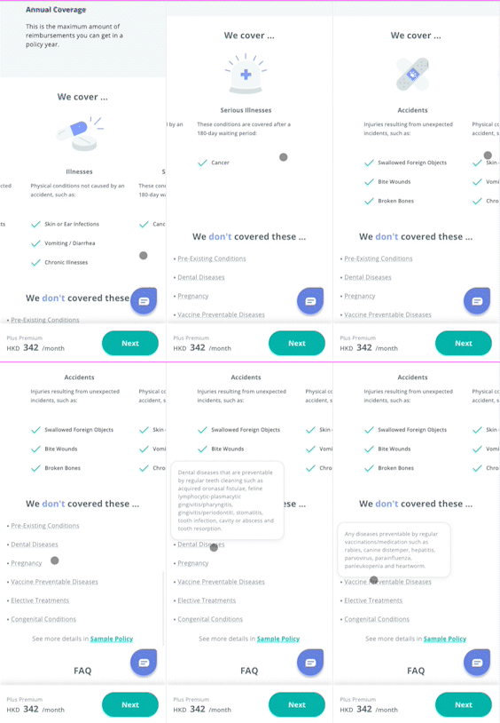
Instead of only listing covered and not covered items for users, we also group related conditions together for users’ better understanding.
Ask customers to provide documents later
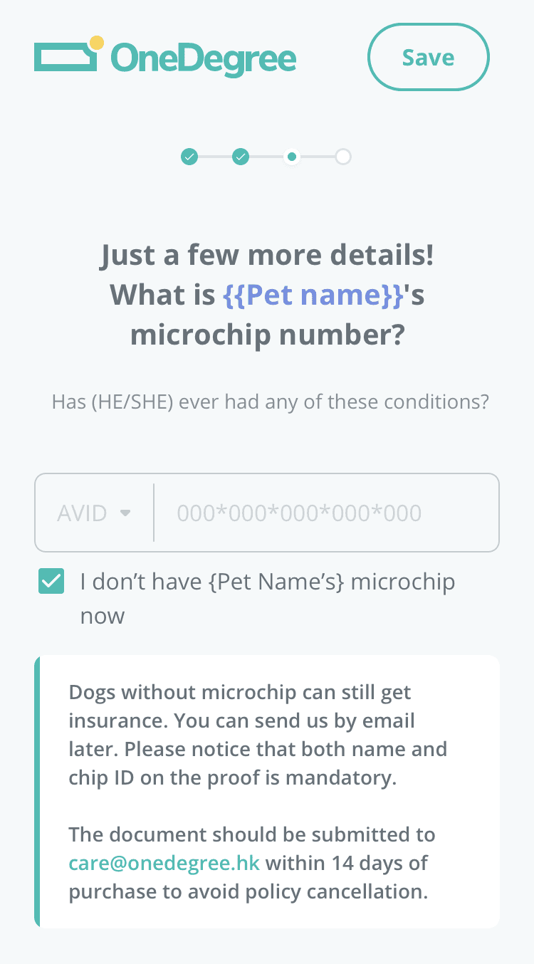
Microchip numbers isn’t a “must” info anymore when users are purchasing. Customers can provide it within 14 days after purchase the policy.
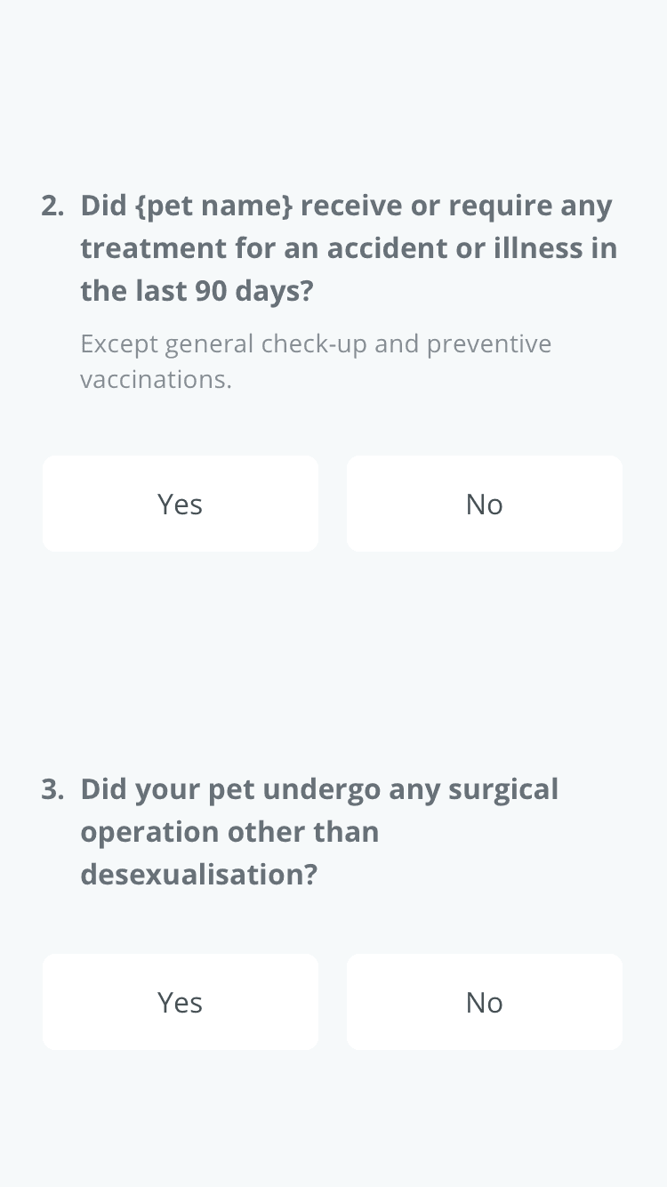
Instead of letting customers read a long symptom list to find out which condition their pets might exist, we ask another two questions to evaluate the pet's medical history.
06 Impact
Increased 35% policyholders of cat owners
After allowing users to provide microchip numbers after purchase, the policyholder amount of the cat owners increased by about 35%. (Data: 2 weeks after the function is launched)
Reduce the frequently asked questions that our Customer Service Team had to process
The common questions related to coverage and plan were reduced since users can find most of the answers on the page.
We collected a satisfaction survey after users finished the purchase to understand whether customers came across problems during the purchase. According to 3,541 answers, the average score is 4.6 out of 5.
60% of the users feel there’s no problem with the flow. Only 7% of users found that they didn’t understand some of the insurance terms used, and 5% of the users thought that the plan descriptions were unclear.
Become a purchase flow framework for other insurance products
07 Reflection in 2024
This case study was initially completed in 2022, and I refreshed it in 2024 since I moved my portfolio over to new platform.
I wanted to rewrite the entire case study at first, but ended up with keeping most of the content. Because this case study captures how I framed a project when as a junior UX designer, I can see my growth through it. It’s so meaningful and beautiful to me.
Looking back, the biggest lesson was realizing I hadn’t fully considered how to manage all the different stakeholders.
As a junior UX designer at the time, I was entirely focused on how to make the purchase flow as clear and trustworthy as possible for users—specifically, those purchasing insurance.
While that’s a key result, I now see there were many more stakeholder teams involved than I had understood back then. Besides the core engineering team I worked with, the marketing team I communicated closely with, and the Risk and Actuarial teams mentioned in the case study, I also should have considered input from customer service and claims teams.
If every team could collaborate even more closely on this purchase flow, I’m sure we could deliver an smoother, more complete insurance experience for users with OneDegree.
(Thankfully, even though I hadn’t considered all these stakeholders, our reliable PM (Lynn) and senior designer (Ivy) made sure everyone’s needs were gathered and passed on to me. Huge thanks to them for that!)
